Billing Report - Graphical
This page contains a graph showing billed accounts over time, with tiles showing the number of accounts of each type.
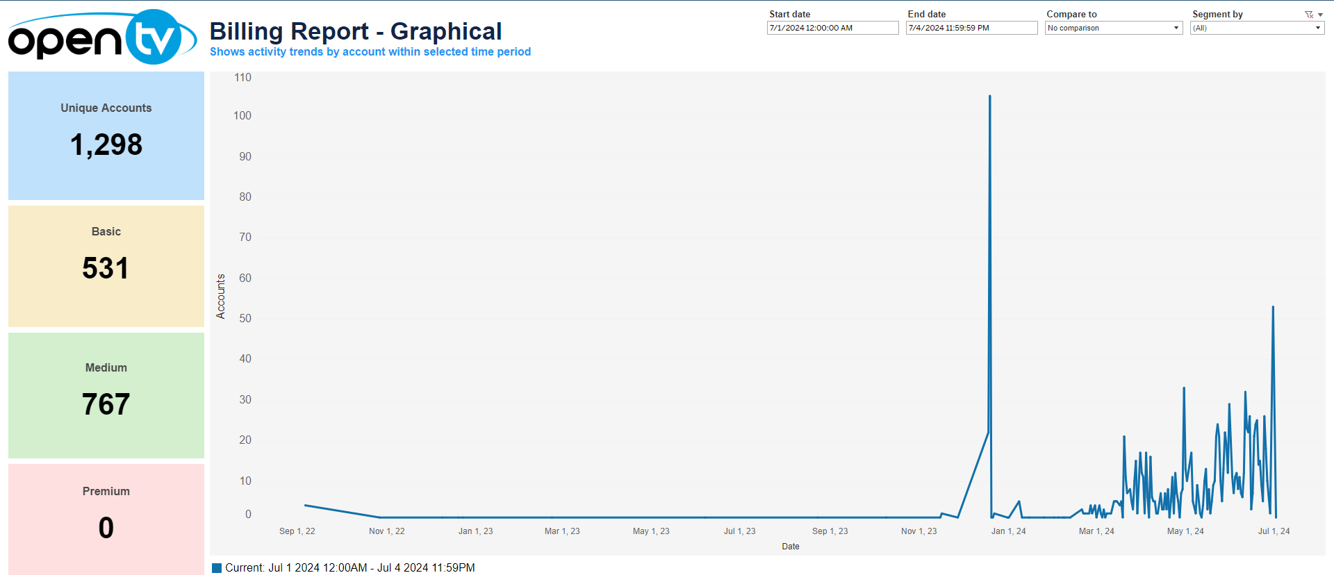
Drop-down filters and Date selection
The top-right of the page shows Start date and End date selection boxes. The default time interval is one day. Selecting from each box loads the data instantly. To the right of this are two drop-down menus, Compare to and Segment by allowing users to compare the data to the directly preceding period or the same period last year, and to filter by account type; Basic, Medium, or Premium.

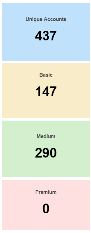
Account Types
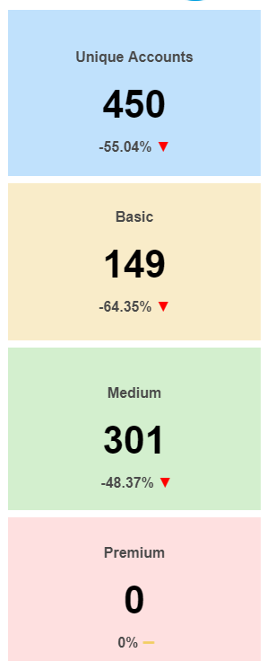
To the left of the graph, the report contains four coloured tiles which show the total number of Unique Accounts, followed by the number of Basic, Medium, and Premium accounts respectively.
Applying the Compare to filter for either the Directly preceding period or Same period last year causes a percentage change value to appear at the bottom of each tile, with a corresponding indicator icon in green, yellow or red to show an increase, decrease or no change compared to the present value.
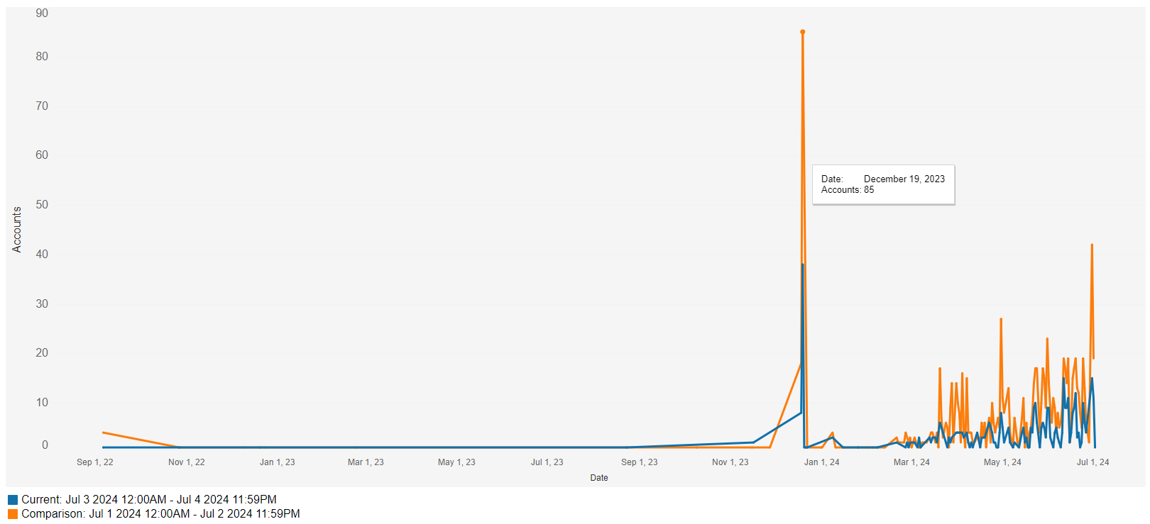
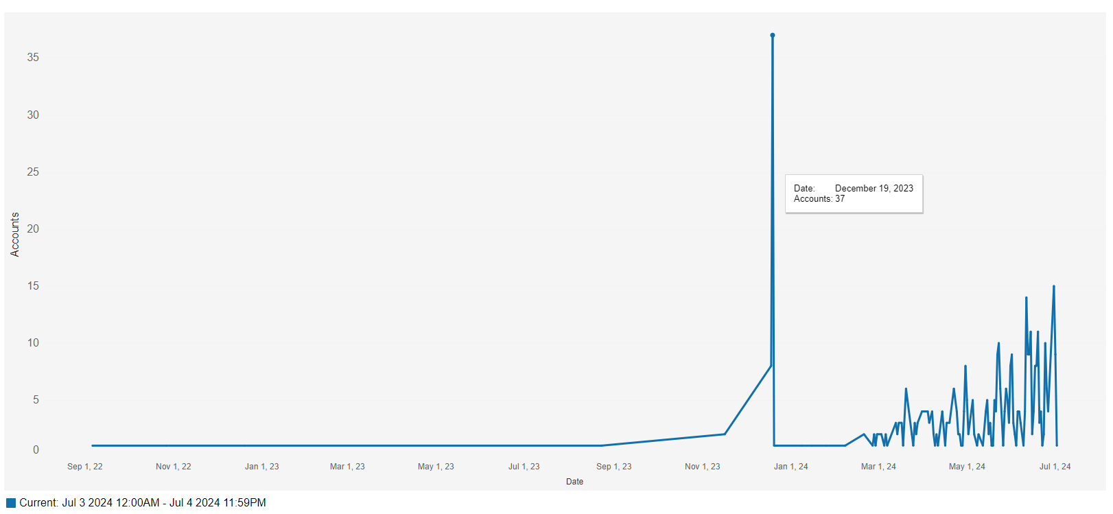
Billing Report Graph
The graph shows the number of billed accounts over time. The mouseover tooltip shows the specific date selected with the corresponding number of billed accounts. A legend is also shown below the graph.
Applying the Compare to filter for either the Directly preceding period or Same period last year causes a comparison line (in orange) to appear alongside the existing line. This line has the same tooltip and the legend below the graph is updated accordingly.