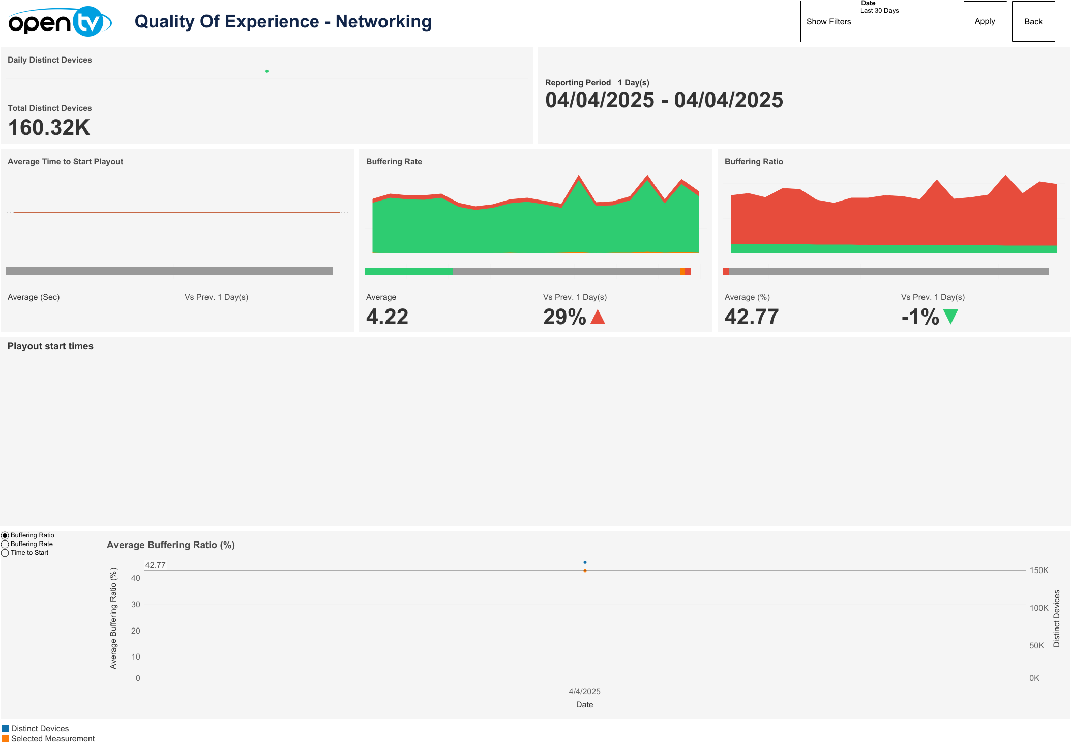
Networking
This page displays the network data. The default view shows a reporting period of one day, with sheets for Total Daily Distinct Devices, Average Time To Start Playout, Buffering Rate, Buffering Ratio, and a chart showing Buffering Ratio, Buffering Rate, and Time to Start over the selected time period.
Drop-down filters
The top-right of the page contains a Show Filters button.
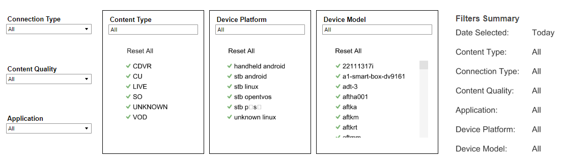
Clicking this causes six drop-down menus to appear directly below, allowing users to filter data by Connection Type, Content Quality, Application, Content Type, Device Platform, and Device Model respectively. The first three drop-down menus are single-select, whilst the latter three (each with a border frame) are multi-select. A Filters Summary is also shown to the right, which lists the currently selected filters and date.
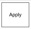
To apply the selected filters, click the Apply button to the far-right.
When filters are shown, the Hide Filters button appears. Clicking this hides the filter options.
Below Apply, the Reset button also appears. Clicking this resets each filter selection to 'All’ as default.
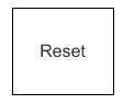
Clicking Reset does not reset the selected Date to the report default, i.e., ‘Today’.
Date
The top right of the page shows a Date drop-down menu, with preset time intervals for Today, Yesterday, Last 7 days, Last 14 days, and Last 30 days. Selecting one of these options then clicking Apply loads the data.
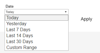
Users can also select Custom Range, which causes the From and To date fields to appear below, and allows users to specify any time interval (provided dates are not in the future). Users must then click Apply to load the data.
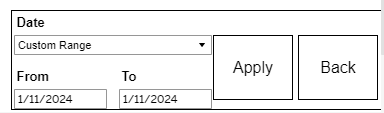
A Back button is also shown at the top right of this page. Clicking it returns the user to the Overview page.

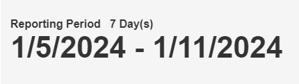
Below the Date drop-down menu, the report shows the selected Reporting Period day count and specific dates chosen.
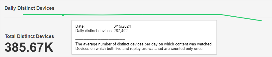
Daily Distinct Devices
Below the top-left drop-down menus, the report shows a chart and count for Daily Distinct Devices based on the selected filters. The mouseover tooltip gives further information and definitions.
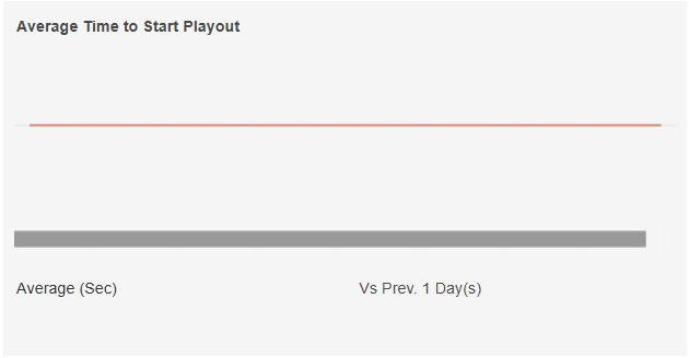
Average Time to Start Playout
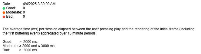
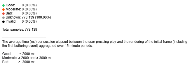
This chart and QoE bar show the count of sessions reporting Good, Moderate, and Bad times to start playout based on the selected time interval and filters.
The average time to start playout (secs) based on the selected time interval and filters is shown at the bottom left and the percentage change in average time to start playout compared to the directly preceding time interval is shown with an up/down/neutral indicator at the bottom right.
Individual regions can be highlighted by single-clicking. The mouseover tooltips on the chart and bar give further information and definitions.
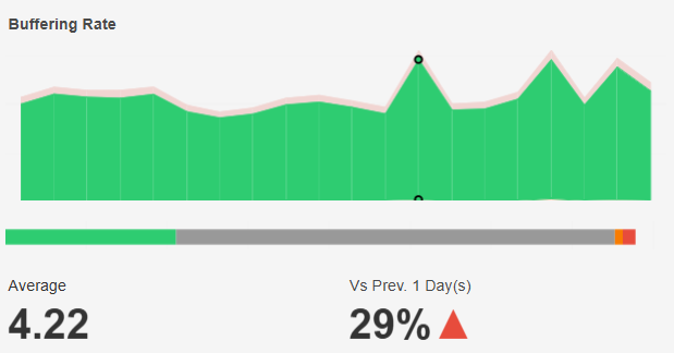
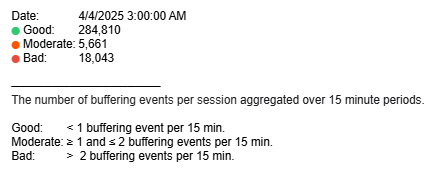
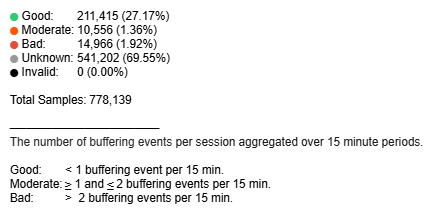
Buffering Rate
This chart and QoE bar show the count of sessions reporting Good, Moderate, and Bad buffering events based on the selected time interval and filters.
The average number of buffering events based on selected time interval and filters is shown at the bottom left and the percentage change compared to the directly preceding time interval is shown with an up/down/neutral indicator arrow at the bottom right.
Individual regions can be highlighted by single-clicking. The mouseover tooltips on the chart and bar give further information and definitions.
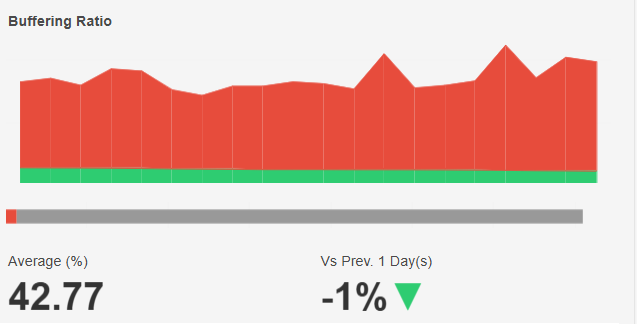
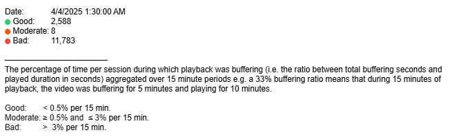
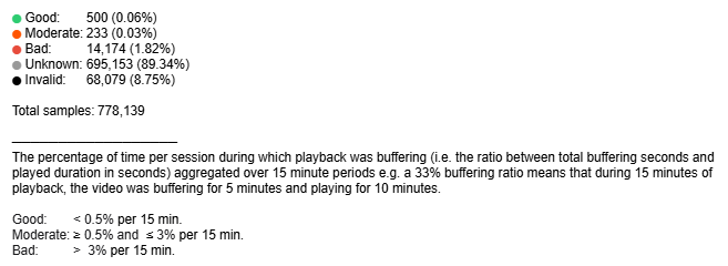
Buffering Ratio
This chart and QoE bar show the count of sessions reporting Good, Moderate, and Bad buffering ratios based on the selected time interval and filters.
The average buffering percentage based on the selected time interval and filters is shown at the bottom left and the percentage change compared to the directly preceding time interval is shown with an up/down/neutral indicator arrow at the bottom right.
Individual regions can be highlighted by single-clicking. The mouseover tooltips on the chart and bar give further information and definitions.
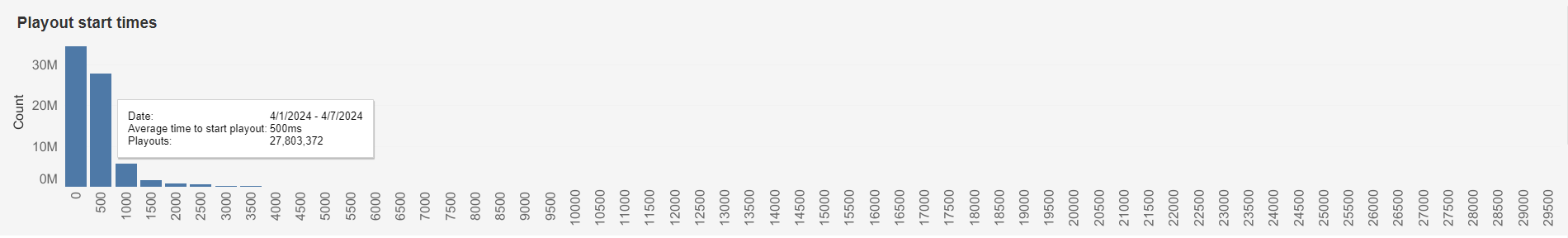
Playout Start Times
This chart shows the number of playback sessions whose average playout start times lie within each 500ms time interval, based on the selected date interval and filters.
The mouseover tooltip gives further information.
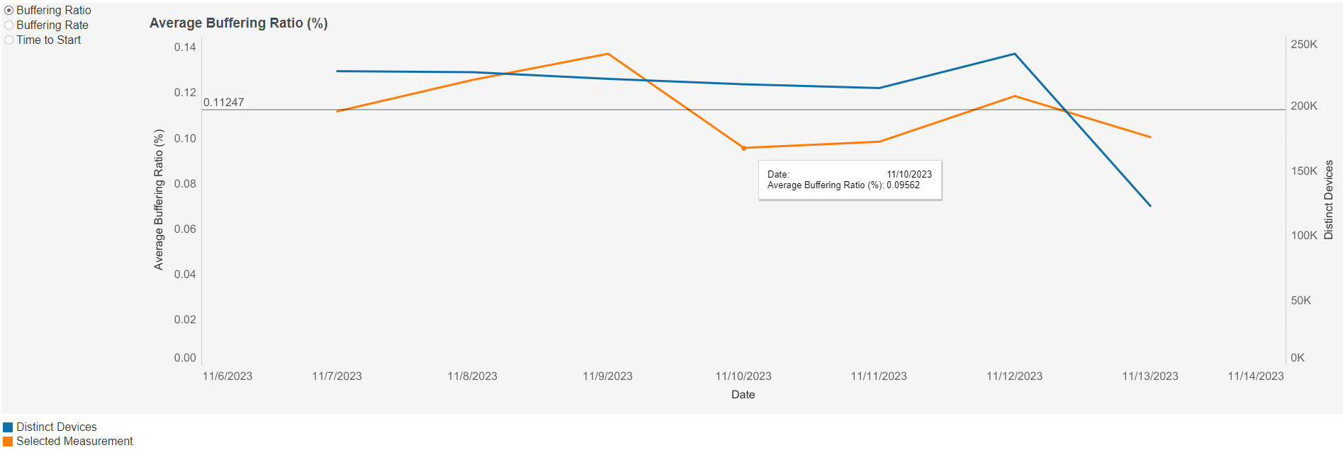
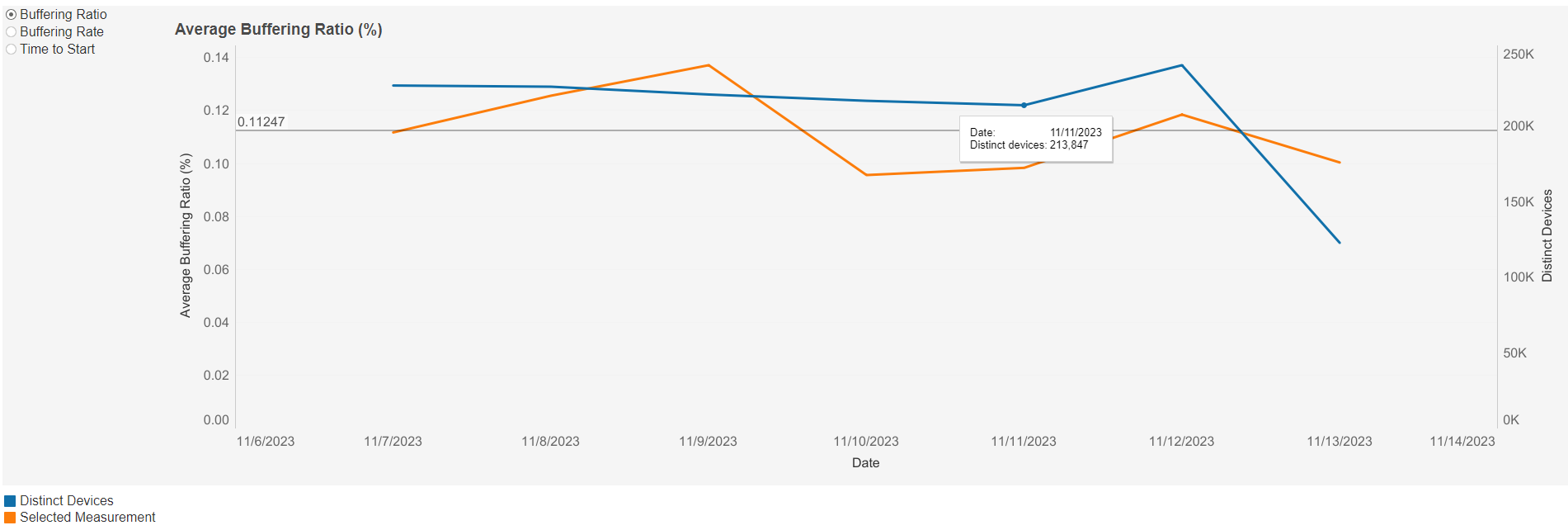
Average Buffering Ratio (%) Line Graph
This graph shows the average buffering ratio (%) over time based on the selected filters. Individual lines can be highlighted by single-clicking. A colour legend is shown at the bottom left below the graph.
A mouseover tooltip on each line gives further information and definitions.
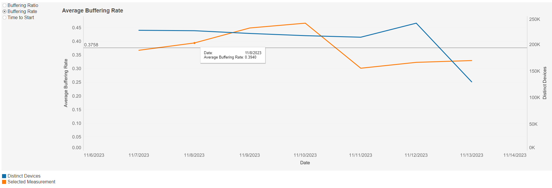
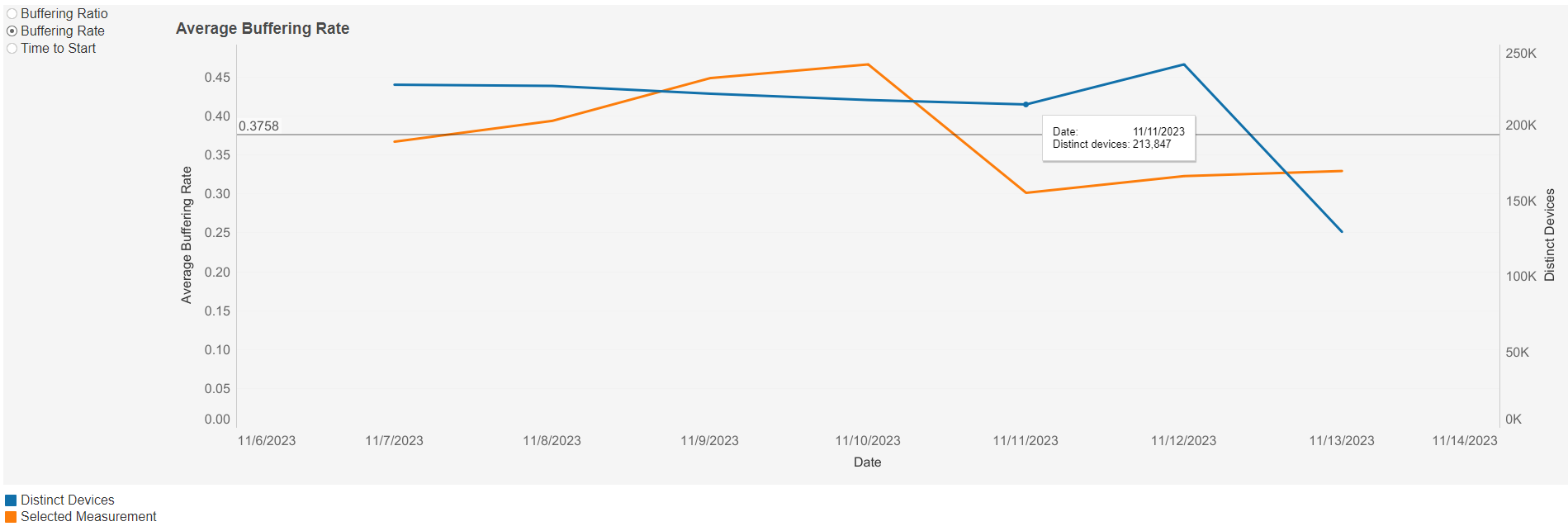
Average Buffering Rate Line Graph
This graph shows the average buffering rate over time based on the selected filters. Individual lines can be highlighted by single-clicking. A colour legend is shown at the bottom left below the graph.
A mouseover tooltip on each line gives further information and definitions.
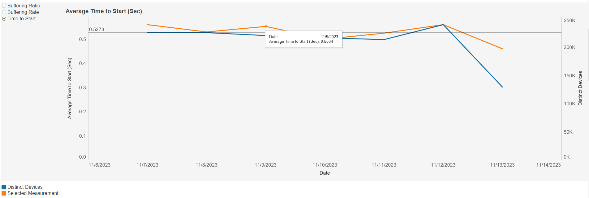
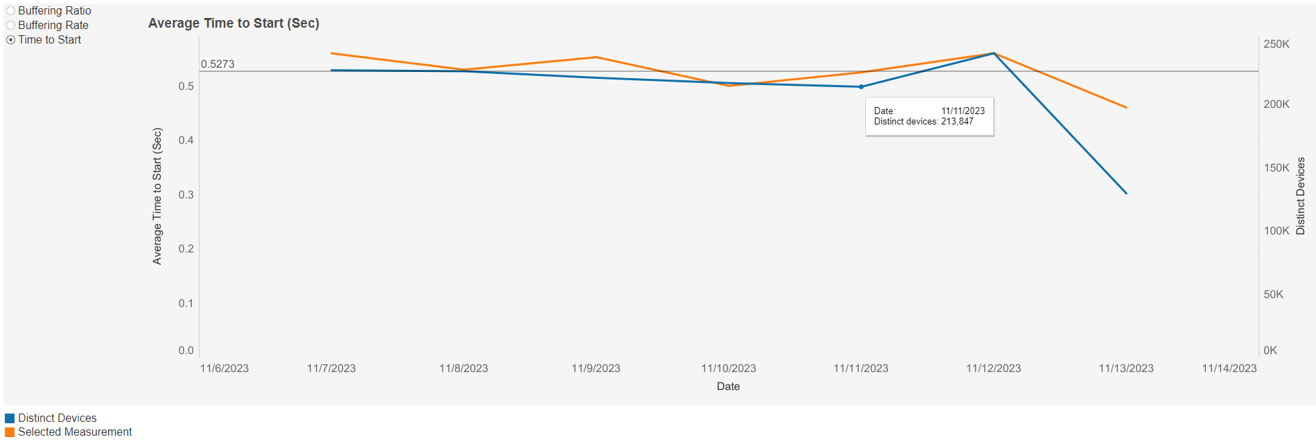
Average Time To Start (Sec) Line Graph
This graph shows the average time to start (sec) over time based on the selected filters. Individual lines can be highlighted by single-clicking. A colour legend is shown at the bottom left below the graph.
A mouseover tooltip on each line gives further information and definitions.