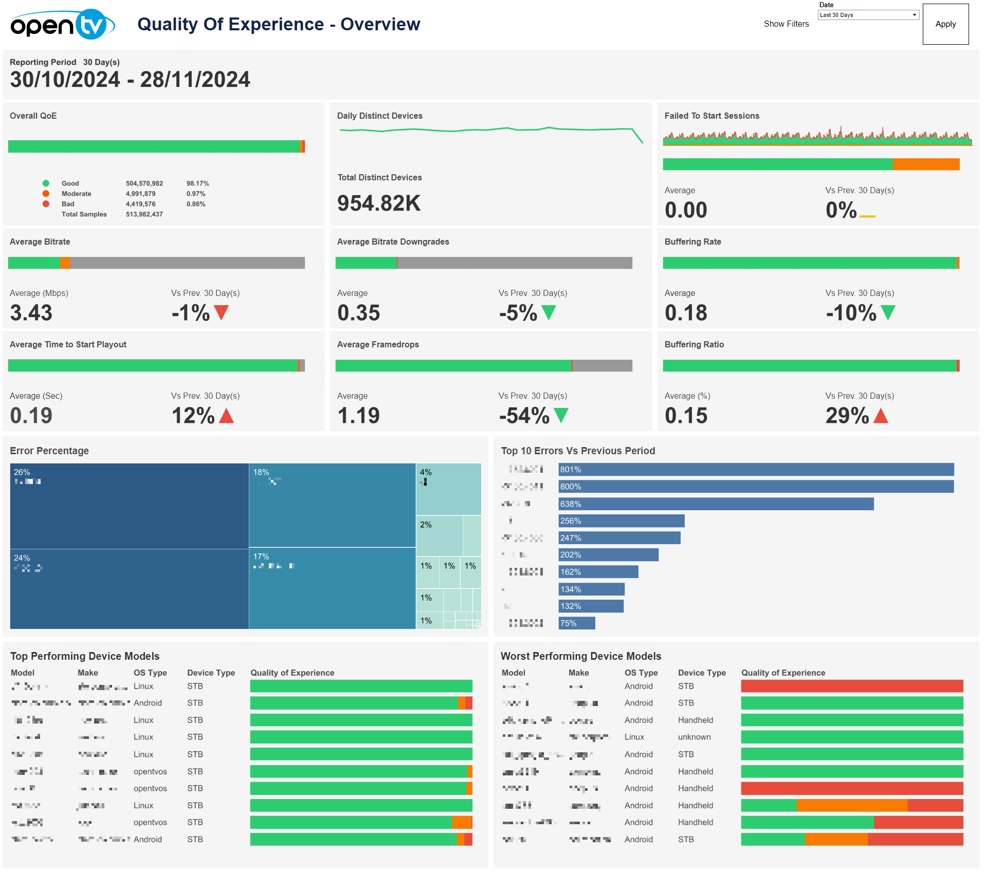
Overview
The first page provides an overview of the QoE for various TV metrics and analytics.
Drop-down filters
The top-right of the page contains a Show Filters button.
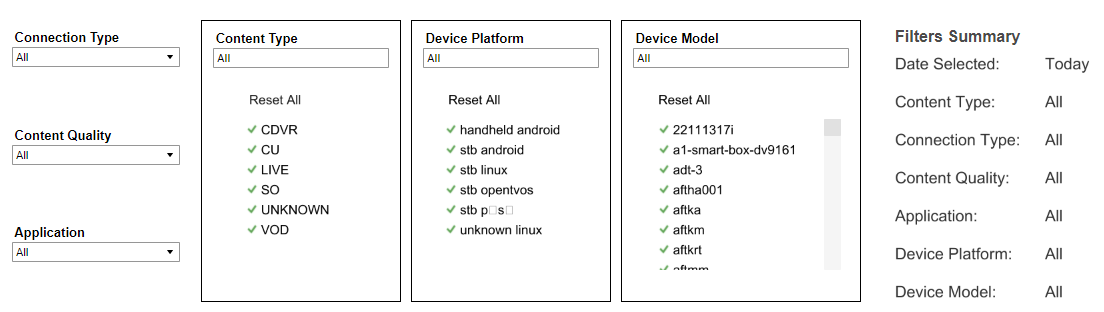
Clicking this causes six drop-down menus to appear directly below, allowing users to filter data by Connection Type, Content Quality, Application, Content Type, Device Platform, and Device Model respectively. The first three drop-down menus are single-select, whilst the latter three (each with a border frame) are multi-select. A Filters Summary is also shown to the right, which lists the currently selected filters and date.
To apply the selected filters, click the Apply button to the far-right.
When filters are shown, the Hide Filters button appears. Clicking this hides the filter options.

Below Apply, the Reset button also appears. Clicking this resets each filter selection to 'All’ as default.
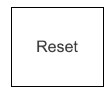
Clicking Reset does not reset the selected Date to the report default, i.e., ‘Today’.
Date
The top right of the page shows a Date drop-down menu, with preset time intervals for Today, Yesterday, Last 7 days, Last 14 days, and Last 30 days. Selecting one of these options then clicking Apply loads the data.
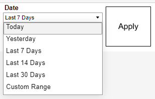
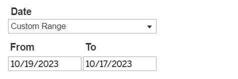
Users can also select Custom Range, which causes the From and To date fields to appear below, and allows users to specify any time interval (provided dates are not in the future). Users must then click Apply to load the data.
Selecting a From date that lies in the future causes the Apply button to disappear:
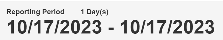
Below the filters, the report shows the selected Reporting Period day count and specific dates chosen.
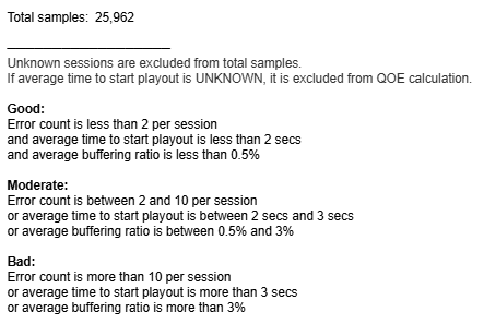
Overall QoE
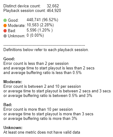
Below Reporting Period, the report shows the Overall QoE bar based on the selected filters. The mouseover tooltip gives further information and definitions.

Overall Metrics
The report then shows a total of eight sheets for the overall metrics based on the selected filters. These are Daily Distinct Devices, Failed To Start Sessions, Average Bitrate, Average Bitrate Downgrades, Buffering Rate, Average TIme To Start Playout, Average Framedrops, and Buffering Ratio respectively.
Daily Distinct Devices shows a line chart and count. Each other sheet contains a colour-coded QoE bar, whilst the Failed To Start Sessions sheet also includes a colour-coded area chart which shows the change in the number of failed to start sessions classed as Good, Moderate, or Bad based on the selected filters.
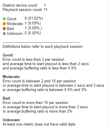
For all QoE bars and charts displayed, a mouseover tooltip gives further information and definitions similar to the Overall QoE bar described above.
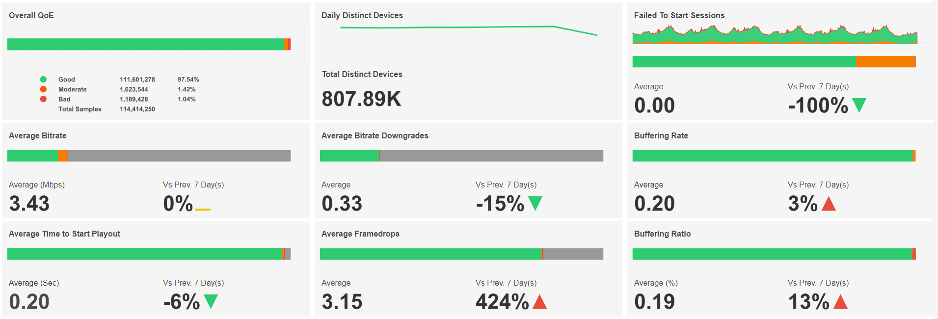
The Average (%) tooltip on the Buffering Ratio sheet ignores any buffering ratios below 0 and greater than 1.
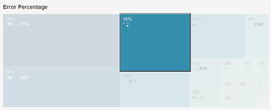
Error Percentage
Below these sheets, the report shows a tiled area chart for Error Percentage. The area of each tile corresponds to the percentage of each error code contributing to the total based on selected filters. A mouseover tooltip gives further information and definitions.
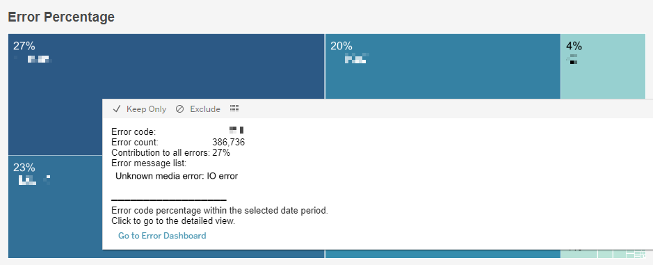
Single-clicking any area tile highlights the selected area and hides all others.
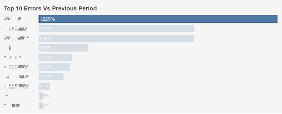
Top 10 Errors Vs Previous Period
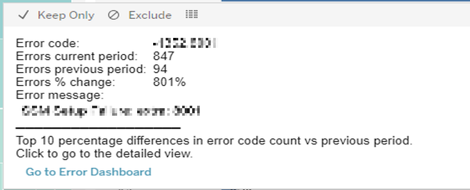
This table ranks the percentage change in occurrences of each error when compared to the directly preceding time interval. The list is sorted by percentage change. A mouseover tooltip gives further information and definitions.
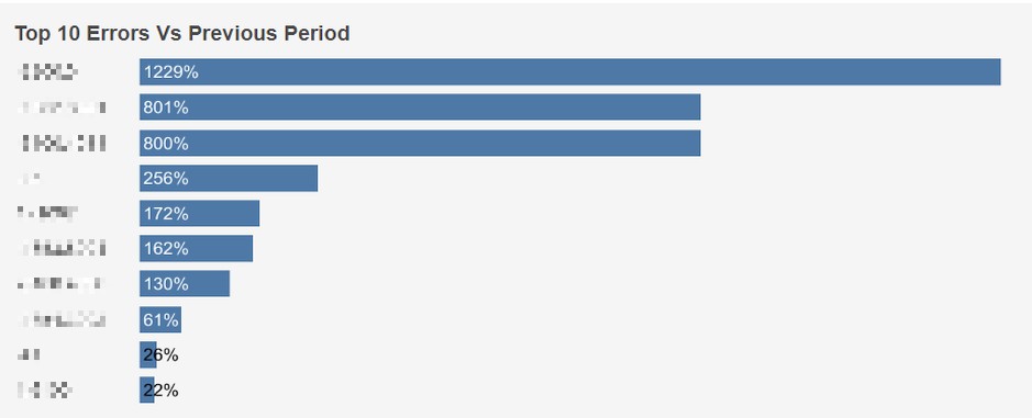
Single-clicking any row highlights the selected row and hides all others.
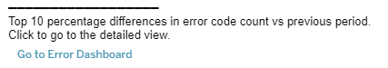
Hovering over the detailed area view displays a tooltip allowing users to drill-down to the Errors page of the dashboard.
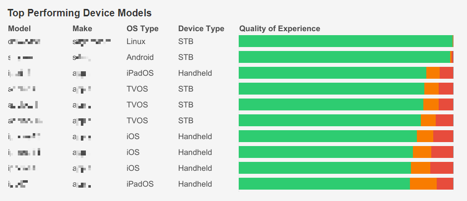
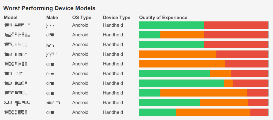
Top/Worst Performing Device Models
These tables rank the 10 top/worst devices based on selected filters. Top Performing Device Models is sorted by distinct device count (descending) and Worst Performing Device Models is sorted by the % of devices classed as having bad QoE (descending).
A mouseover tooltip gives further information and definitions when hovering over the Quality of Experience column.